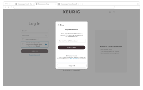
Login/Signup enhancement
CLIENT
keurig.ca
keurig.com
MY ROLE
UX Design
SUMMARY
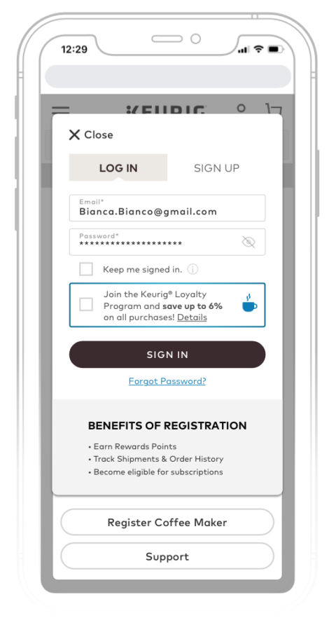
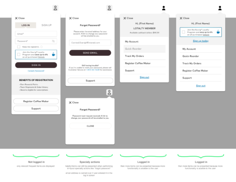
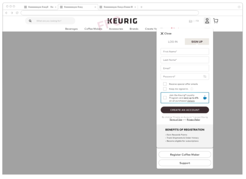
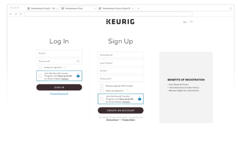
One of the weak points of this website was the static login page. The flow was not optimal as the customer was redirected to this login page. The login flyout was implemented to reduce friction and keep the customer where they are to continue their shopping journey.
